|
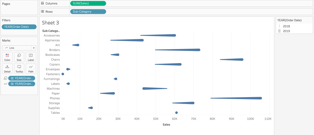
Have you ever looked at a visualization and think, "How'd they do that?" I know I have. 🙋🏻♀️ So much like the Tableau podcast I used to co-host, I decide that I would find out, put it in my own words, and share out on my blog so I remember how to create them later because my memory 👎🏻. So for my first HTDT, I was looking at the Workout Wednesday site and found the comet chart challenge. I was more interested in the how'd they do that than meet the specific requirements that were outlined. So off to google I went and that's where I found Steve Wexler's blog on comet charts. For a minute, I thought I might just make the chart following Steve's directions (his screenshots are on point), point to his blog, and call it a day. However, you know how it makes more sense when you put it in your own words? So I decided to reserve engineer this Comet Chart from a few of the screenshots. 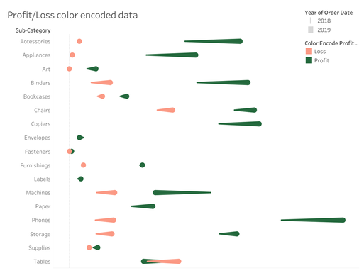 A light red and dark green comet chart to show the change from year 1 and year 2 for sub-categories. Why'd they do that?Before I get into the HTDT, I want to share why you'd use a comet chart. It's an alternative to side-by-side data comparison for two time periods. Is a good alternative? Well, that's up to your audience. Here are some pros and cons of a comet chart: Pros
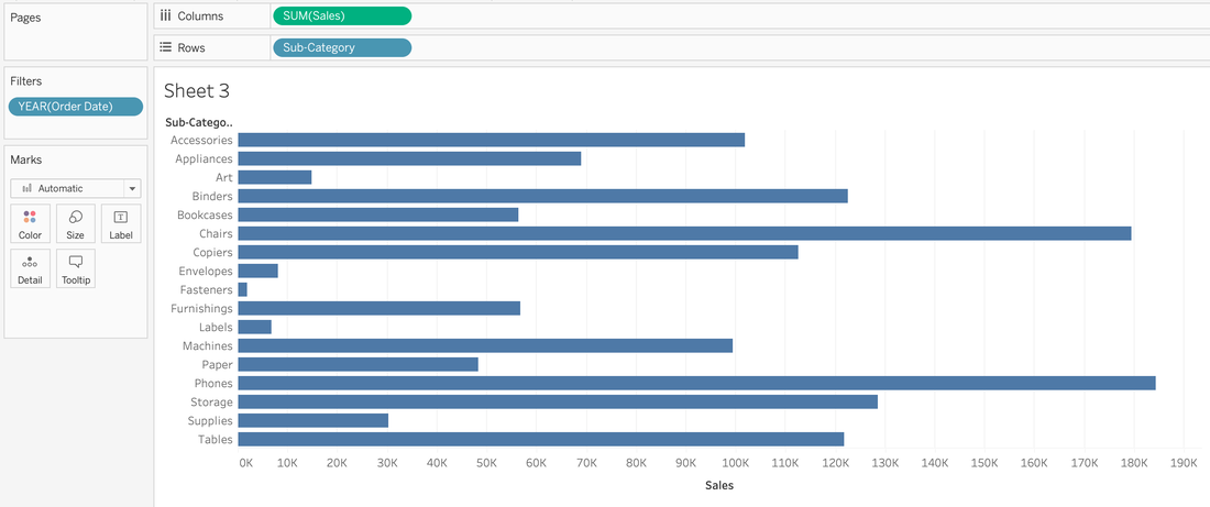
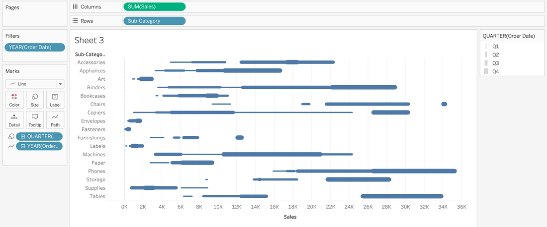
How'd they do that?
And that's how they did it!
0 Comments
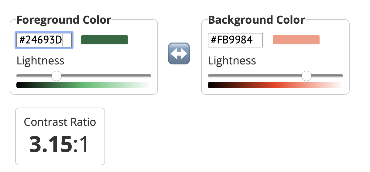
Around 2017-ish, there was a moment where red and green were a BIG no no...and if you used it, the dataviz police would come with their cop cars to let you know that it was WRONG. I will admit to having my moments of policing...whether I said them in my head or out loud. But like many things, if we only read the headline, we miss the whole story. When it comes to red and green, the story is contrast, not the colors per se. Contrast is Queen (or King, if you prefer) So, I when I was creating a comet chart for practice, I color encoded the data with a light red and a dark green.  I checked these colors, just to make sure I was okay and yes--I was.
If you'd like, you can review the WebAIM site to explore the different aspects of how to use these two colors together. I also found a different website than the Coblis Color Blindness Simulator that I typically use to check for color blindness. I used a simulator from Pilestone that I thought had a great experience as well. The following is a screen recording of me testing these two colors for color deficiency. I addressed the technical aspects of red and green, but when there are alternative palettes out there, why would I use red and green? Color association. People understand that red means loss, danger, bad whereas green means good, health, profit, growth.
The big takeaways: know the story, not just the headline red and green are okay to use, just check the contrast first. |

 RSS Feed