|
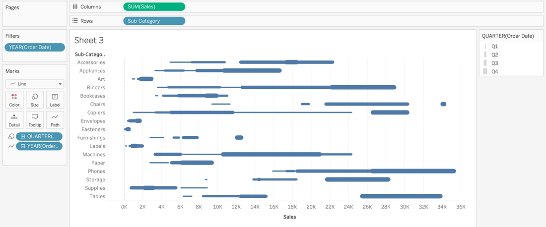
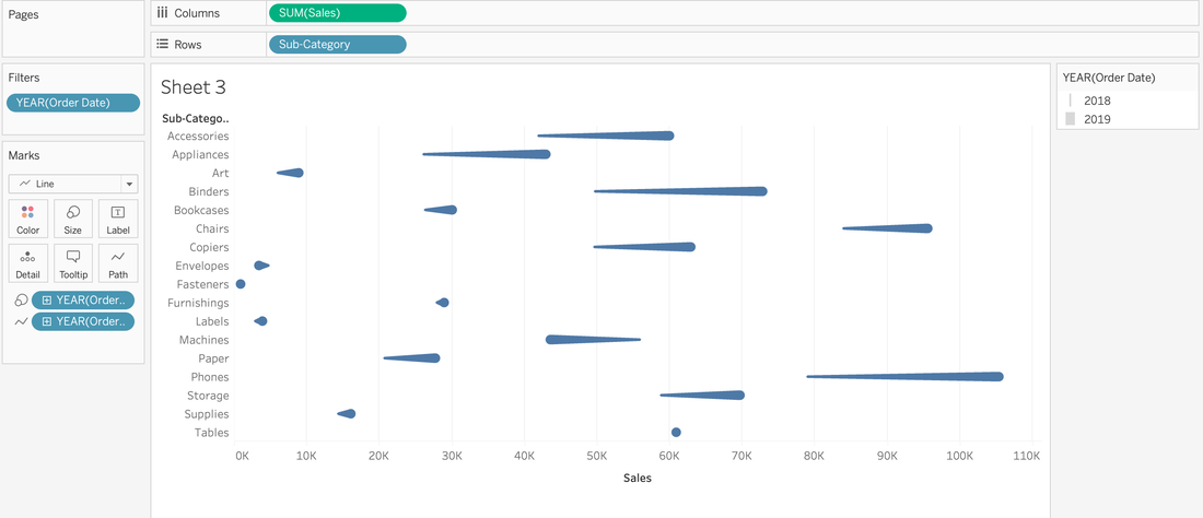
Have you ever looked at a visualization and think, "How'd they do that?" I know I have. 🙋🏻♀️ So much like the Tableau podcast I used to co-host, I decide that I would find out, put it in my own words, and share out on my blog so I remember how to create them later because my memory 👎🏻. So for my first HTDT, I was looking at the Workout Wednesday site and found the comet chart challenge. I was more interested in the how'd they do that than meet the specific requirements that were outlined. So off to google I went and that's where I found Steve Wexler's blog on comet charts. For a minute, I thought I might just make the chart following Steve's directions (his screenshots are on point), point to his blog, and call it a day. However, you know how it makes more sense when you put it in your own words? So I decided to reserve engineer this Comet Chart from a few of the screenshots. 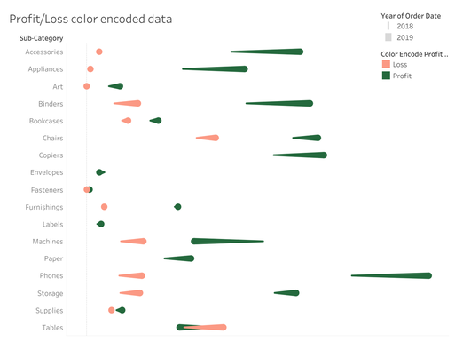 A light red and dark green comet chart to show the change from year 1 and year 2 for sub-categories. Why'd they do that?Before I get into the HTDT, I want to share why you'd use a comet chart. It's an alternative to side-by-side data comparison for two time periods. Is a good alternative? Well, that's up to your audience. Here are some pros and cons of a comet chart: Pros
How'd they do that?
And that's how they did it!
0 Comments
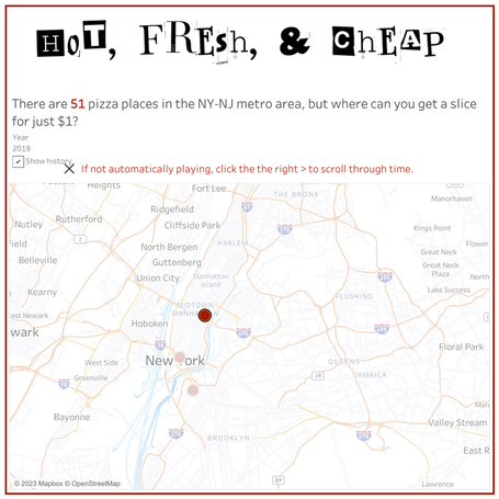
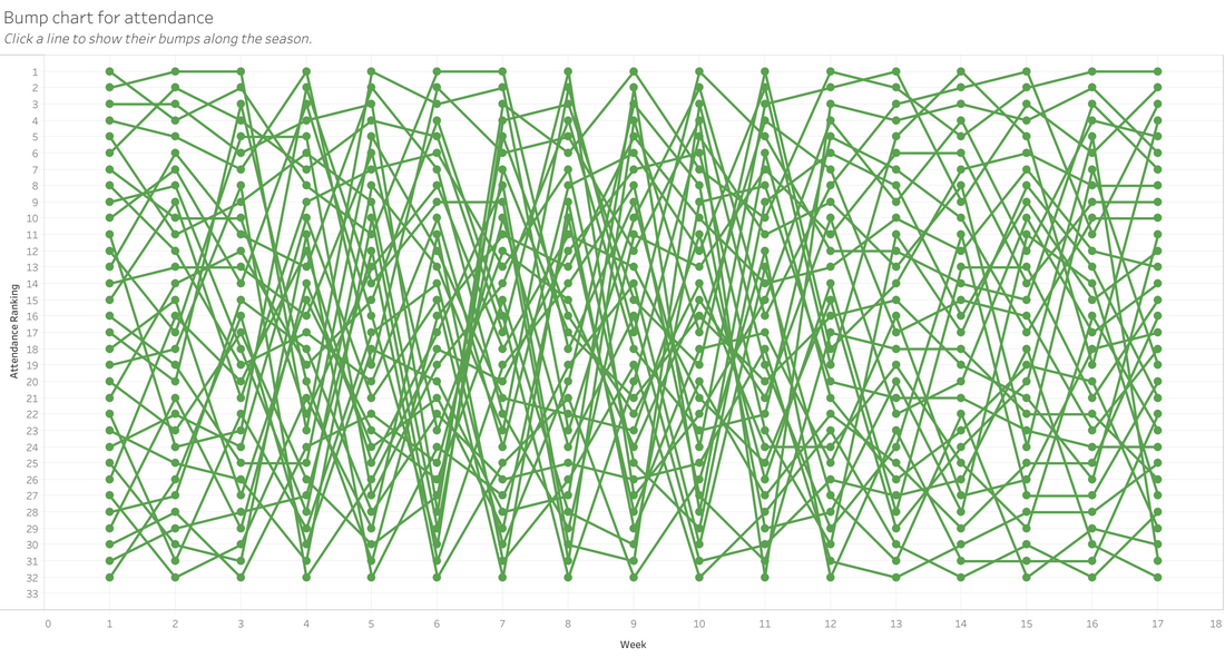
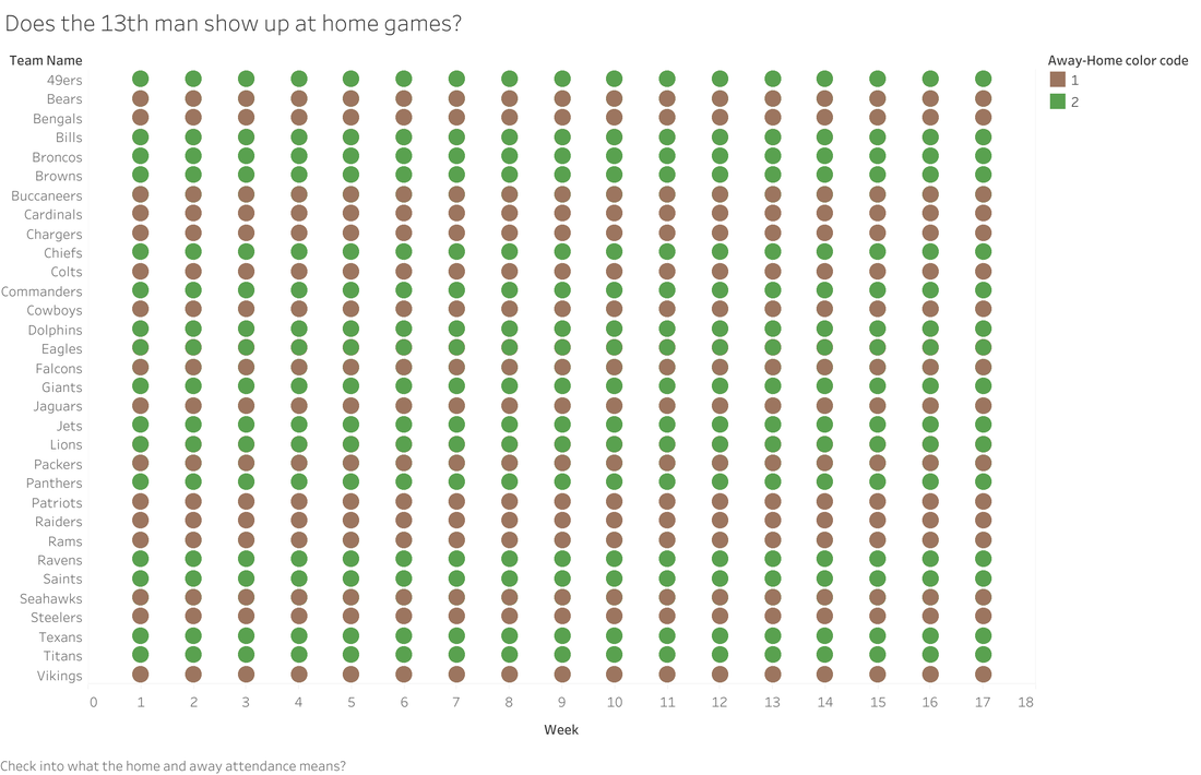
I recently used a Makeover Monday data set for pizza slices in NY/NJ. I had some cool ideas as to what I could do, but as I learned with my NFL Attendance Analysis viz (that's still a WIP), I really just need to time box myself to one night. With the NFL viz, I was going to visualize all teams at first, then I was going to focus on my home team, the Commanders. I was talking to my husband about this viz, and he said, "You know that they have reduced the stadium capacity, right?" Uh, no. I did not know that. And it would make for a great data story. I looked up stadium capacity by year and had a plan. By this time, it was beyond Monday & not only did I need to focus on other things, I was still trying to see if there was a chart I could tweak and salvage from what I had already done. I feel like these charts should be a piece of art called: "Life is messy, so are these charts" While I had an idea, I was just lacking on how to execute on it. My brain was messy like that bump chart. That's when I realized two things:
 When I did this viz, I didn't do much data cleaning or prep work. I basically just connected to the data and started to viz. And then I remember something from the mid-2010s, where there was a whole thing about not checking data quality while promoting visualizations. And while I'm not really promoting my viz on twitter or reddit, it is publicly available. That's when I decided to share in the details that this is practice and not rely on this visualization. I also decided to use a hashtag so that it was searchable and people/me could see all of fizzes where I'm touching the tool. And if you know me, you know that I love alliteration...a lot! That's why I decided to use #touchthetool as my hashtag. I love it and I think it will give me the permission to create (and clean, when needed). 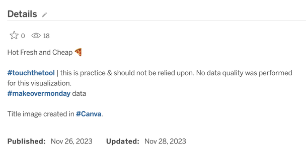 |
 RSS Feed