|
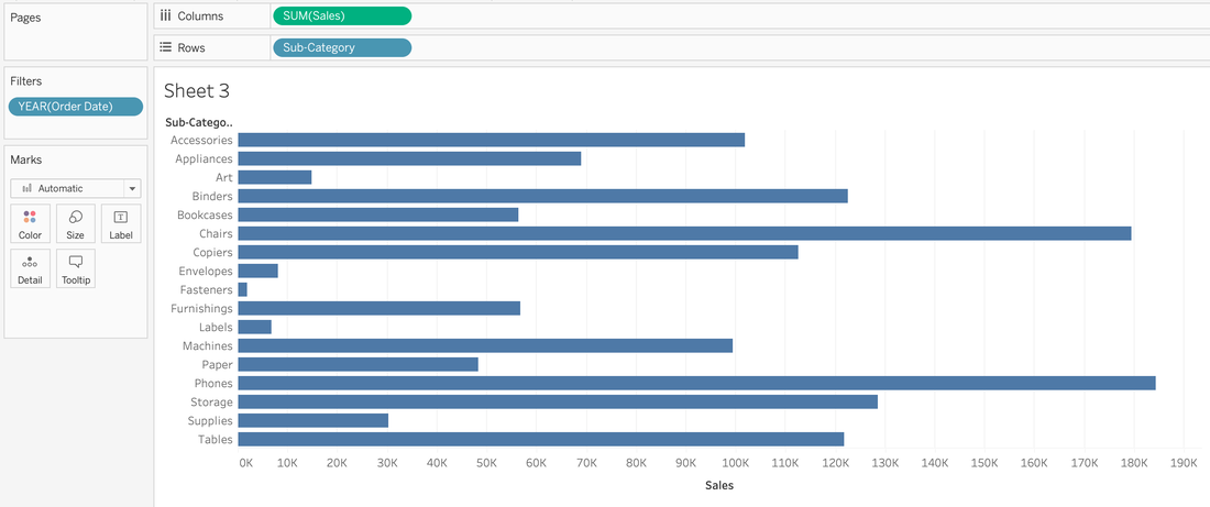
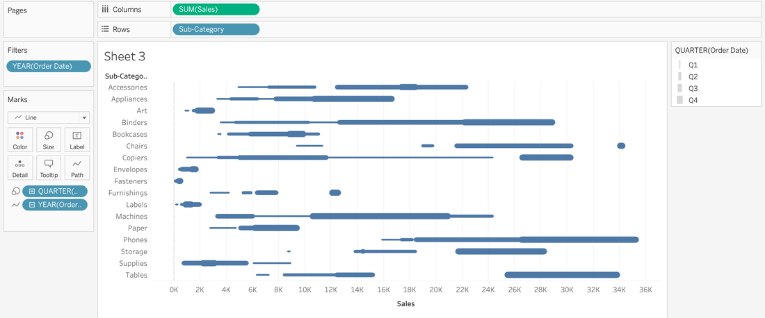
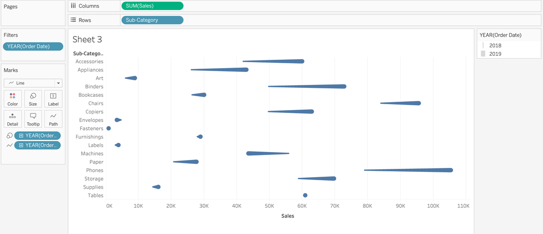
Have you ever looked at a visualization and think, "How'd they do that?" I know I have. 🙋🏻♀️ So much like the Tableau podcast I used to co-host, I decide that I would find out, put it in my own words, and share out on my blog so I remember how to create them later because my memory 👎🏻. So for my first HTDT, I was looking at the Workout Wednesday site and found the comet chart challenge. I was more interested in the how'd they do that than meet the specific requirements that were outlined. So off to google I went and that's where I found Steve Wexler's blog on comet charts. For a minute, I thought I might just make the chart following Steve's directions (his screenshots are on point), point to his blog, and call it a day. However, you know how it makes more sense when you put it in your own words? So I decided to reserve engineer this Comet Chart from a few of the screenshots. 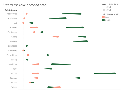 A light red and dark green comet chart to show the change from year 1 and year 2 for sub-categories. Why'd they do that?Before I get into the HTDT, I want to share why you'd use a comet chart. It's an alternative to side-by-side data comparison for two time periods. Is a good alternative? Well, that's up to your audience. Here are some pros and cons of a comet chart: Pros
How'd they do that?
And that's how they did it!
0 Comments
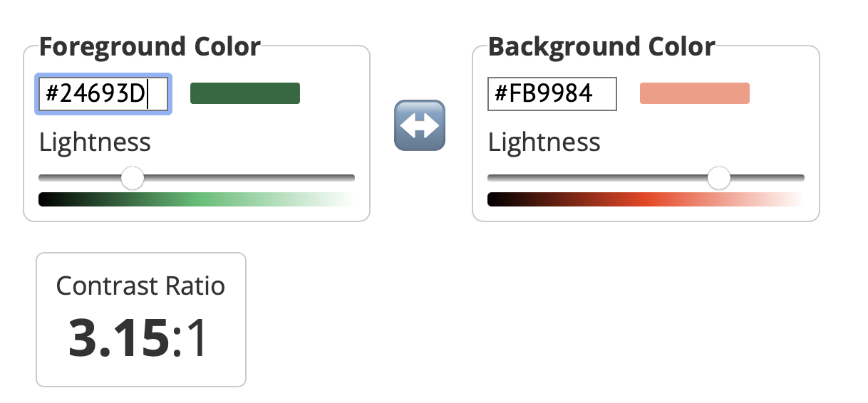
Around 2017-ish, there was a moment where red and green were a BIG no no...and if you used it, the dataviz police would come with their cop cars to let you know that it was WRONG. I will admit to having my moments of policing...whether I said them in my head or out loud. But like many things, if we only read the headline, we miss the whole story. When it comes to red and green, the story is contrast, not the colors per se. Contrast is Queen (or King, if you prefer) So, I when I was creating a comet chart for practice, I color encoded the data with a light red and a dark green.  I checked these colors, just to make sure I was okay and yes--I was.
If you'd like, you can review the WebAIM site to explore the different aspects of how to use these two colors together. I also found a different website than the Coblis Color Blindness Simulator that I typically use to check for color blindness. I used a simulator from Pilestone that I thought had a great experience as well. The following is a screen recording of me testing these two colors for color deficiency. I addressed the technical aspects of red and green, but when there are alternative palettes out there, why would I use red and green? Color association. People understand that red means loss, danger, bad whereas green means good, health, profit, growth.
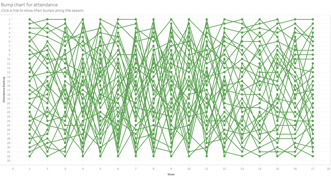
The big takeaways: know the story, not just the headline red and green are okay to use, just check the contrast first. I recently used a Makeover Monday data set for pizza slices in NY/NJ. I had some cool ideas as to what I could do, but as I learned with my NFL Attendance Analysis viz (that's still a WIP), I really just need to time box myself to one night. With the NFL viz, I was going to visualize all teams at first, then I was going to focus on my home team, the Commanders. I was talking to my husband about this viz, and he said, "You know that they have reduced the stadium capacity, right?" Uh, no. I did not know that. And it would make for a great data story. I looked up stadium capacity by year and had a plan. By this time, it was beyond Monday & not only did I need to focus on other things, I was still trying to see if there was a chart I could tweak and salvage from what I had already done. I feel like these charts should be a piece of art called: "Life is messy, so are these charts" While I had an idea, I was just lacking on how to execute on it. My brain was messy like that bump chart. That's when I realized two things:
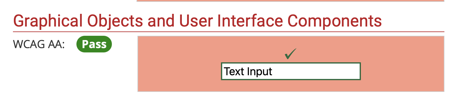
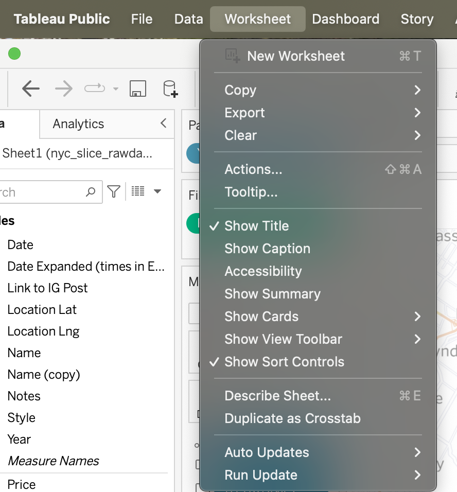
 When I did this viz, I didn't do much data cleaning or prep work. I basically just connected to the data and started to viz. And then I remember something from the mid-2010s, where there was a whole thing about not checking data quality while promoting visualizations. And while I'm not really promoting my viz on twitter or reddit, it is publicly available. That's when I decided to share in the details that this is practice and not rely on this visualization. I also decided to use a hashtag so that it was searchable and people/me could see all of fizzes where I'm touching the tool. And if you know me, you know that I love alliteration...a lot! That's why I decided to use #touchthetool as my hashtag. I love it and I think it will give me the permission to create (and clean, when needed).  I think we know about alt-texting (provide a description alternative) images. But if you don't, you should alt-text .your charts because when a screen reader reads the image, it needs to convey the message of what the image is showing so that you can create a comparable experience. Do you know what Tableau generates for the alt-text in a chart if you don't change it? Check out the example below the map I have in a dashboard. 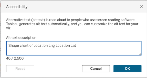 Alt-text chart dialog box in Tableau I don't know about you, but Shape chart of Location Log Location Lat doesn't exactly convey the insights or the data effectively. To change the alt-text, you can either navigate to the drop down arrow for the chart on the dashboard or use the Worksheet menu to navigate to Accessibility.
There are a few pieces of advice out there on how to write an alt-text description. I'm a fan of doing what works for you. Amy Cesal wrote this great piece about alt-texting charts. I'll share my approach in case it's helpful for anyone else. To describe a chart, write what you would tell someone when describing the chart to them. I used this approach to describe the plots on my map. 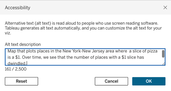 A more descriptive alternative text. If you have a publishing process or checklist, don't forget to add alt-text charts to that list to help people have a comparable experience between the screen reader and visual experience.
I've been blogging and involved in the Tableau community for 10 years as of this year. My first conference was in 2011 and it took me a couple of years to go from 'learn all the things' to 'learn, create, and contribute'. 10 years ago (as of September, I think), I remember being so excited that charts could be beautiful and informative, that I wanted to write about it. Since that time, I was a featured author, a 7x Tableau Ambassador until I stepped down, one of the first women podcasters in the dataviz space, founded a global conference, and helped create data+women (& d+w dc). It's been a lot. Throughout these ten years, I transitioned from away from blogging and vizzing. I created a Mother's Day card & comic pages in Tableau and as time went on, I lost my passion for visualizing data for fun. Enter this year's Iron Viz Feeder. I was inspired to visualize my Ulta purchases. I wrote about the inspiration in my LinkedIn newsletter on how I used Miro to help me with my process. I also had a really great conversation with Lindsay Betzendahl recently and I mentioned--it's like starting all over. Between the feeder and that conversation, I made a decision. I think 10 years in is a great time to get back to what I did ten years ago; viz & blog. A lot has changed over the years. I won't be involved in the hustle culture (#chronica11ychILL) & I'll be making vizzes for me--so some of them won't be best practice or the best way to viz something. One observation that I have about my 10 years of vizzing is that I've become less creative. So I'm on a mission to regain a little creativity. Here's to going back to the future. 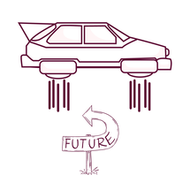  A COE of 1 has the four pillars of COE on their shoulders. In my last post, I shared the Four Pillars of a COE. That approach will definitely be helpful for organizations that have the resources to staff a COE. What if you're a COE of 1 or you're doing COE-esque work on the side? What should you be doing? If I were a COE of one, here's what I would do:
1. Understand the landscape. How do people work and what are their pain points? I talked about this in the Four Pillars post. What's the most important activity that would make their life easier or that they desperately need? Outside of what you learn about the landscape, the following are items that will make your life easier and help support, upskill, and maybe even grow your community. 2. Automate onboarding (as much as possible). Set people up for success. Once they get their license, establish an automated email that includes items like:
3. Personalized learning. First, assess their Tableau skills. I have a Tableau skills quiz that I can help you collect data on which will then inform how you provide personalized learning. If you don't have time or money to get instructor-led training or building your own training, my recommendation is to provide curated learning for each skill level. Additionally, if your organization's learning management system (LMS) has this feature, when people complete their learning path, they can automatically receive a badge. The LMS may also be able to send you training reports (or send a link to a Tableau dashboard that has relevant information to help you measure and monitor training). 4. Automate aspects of enablement.
If you want to do consulting because you love it or it's an expectation, here's a tried and true way to make the most of your time. 5. Automate the booking process for consultations or appointments. In this, you can collect information on what they need help on and what your knowledge base is (there's no point in them asking for your time in data engineering when you provide front-end developer expertise). Based on the results of the form, you can then lead them to your calendar to book an appointment when you're available. There are so many different things you can do to support your community. I would start by automating these aspects of enablement and then focus on what the community told me is their pain point. This means I would spend my time on the issues that matter the most without adversely impacting others in the community. That's a win-win-win. 😎 If enablement isn't your favorite thing or you have too much for one person to do, book a chat to see if I augment your practice. Do you have dreams of setting up a Center of Excellence (or Enablement) or maybe you're making it happen? Where do you start? Here's a breakdown of my recommendation on setting up a COE. Of course, you do what makes sense to your users and your organizations. You can adopt or adapt the TCOE pillars to your organization. Talk with your customersWhy talk with customers?
If you set up a peer review process and people already have a peer review process in place, at least on the surface level, your program won't be successful. Who do you ask? Ask a cross-section of users, including your advanced, intermediate, beginner users as well as managers across different lines of business. This is important to ensure that you have a sufficient perspective. What do you ask? People run from pain and run towards pleasure. What does that mean in a business and COE setting? It means that that people won't use initiatives that are too hard/cumbersome and will use initiatives that help them/make their lives easy. If they have something in place already that makes their life easy, they'll want to continue with that.
Depending on what they say, you may be able to group these into the following pillars:
What initiatives or programs will you have to upskill your users? Consulting This can go either way; either your COE does direct consulting or you implement consulting-like programs like Data Doctors or Office Hours. Onboarding I like to specifically call out onboarding because if you do not set people up for success, you're making their life harder. Enablement Probably the most under-valued pillar, enablement helps users work smarter. To me, enablement is an indirect line item that affects net income. Enablement helps communicate all of the other initiatives that you'll put in place (helping increase the value of your initiatives and the work products of your users). And because of enablement, you can save your users time (our most finite and precious asset) by searching up and finding relevant information. It's an old adage, but time is money. As you can tell, I provided more content on enablement and that's because it is so under-valued. Next StepsNow that you have an idea of what your customers need, what your pillars will be, how do you get started? First, go back to what your customers said when you talked with them. This is where a bit of analysis comes into play. Can the issues be grouped into one of the pillars? What are items/pillars that already work well? Remember the saying from above. People run from pain and run towards pleasure. Start with the items that cures the pain, because pain feels worse than how good pleasure feels. Need help getting started or you've got the framework in place but need help executing it? Let's chat to see if my fractional COE services are a good fit for your organization. LET'S CHAT I shared the Tableau Skills Quiz recently as a great way to help you and your community, so in this post, I'll share what I mean and provide you with a better understanding how two simple and cost effective tools will benefit your Tableau community. Note: While this post is written from the Tableau perspective, you can apply it to any tool or testable skill. What's a skills quiz
How it worksWatch this short video of what the experience is like for someone to go through the quiz and get their results. This video has no sound. There are a few different ways you can implement a quiz. The most popular is a personality test (aka correlated results), weighted score (where answers are assigned point values), and an assessment quiz (correct/incorrect). You can also use branching logic, where it takes people down a certain path of questions based on a prior response. In the sample quiz, I used the weighted score so that I could still segment people into one of three skill levels. Once the quiz is built, you can embed it in a webpage so that traffic is drawn to your page versus the quiz platform used. You can also build pages for each result so that you can easily customize the page. This is where recommendations and resources can live. How quiz tech helps efficiently enable and upskill your communityHere's a visual workflow of how a quiz works. Once someone takes the quiz, they can get their results (either through skipping an opt-in or by providing their email address). When they provide their email, you can segment them to send them information that is pertinent to their results. No need to send a beginner some information on LOD calcs and crazy hacks. You can also analyze the data you get from the quiz platform to learn more and inform your training and enablement strategy because it's a treasure trove of data. The tools & workflow get this in productionFirst, I'll say, I'm biased because I used Interact quiz platform* when I had my quiz side biz for online coaches, so that's what I used in the example quiz. There are other platforms out there, so it may just be a matter of ease of use, cost, and infosec approval. Other platforms include Quiz-Maker, and more. To leverage sending communications relevant to someone skill level (or how they answered key questions), you'll need an email service provider (like Mailer-Lite, MailChimp, etc). Can we afford this? Is this a good investment?Depending on your company, this set up can cost about $1000/year. To help justify the cost, here's a rough analysis you can perform to justify it.
Here's an example: 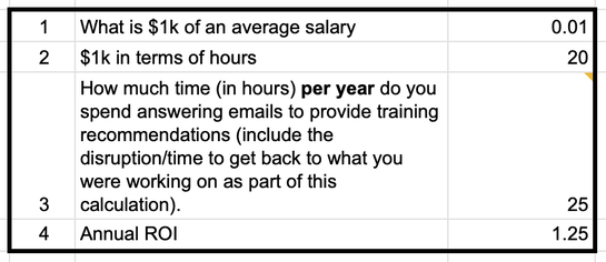 The worksheet that includes the formulas can be found here. You can also look at the opportunity cost of the hours spent on serving your community by comparing it to your backlog. What else can you do if you had those 25 hours back? 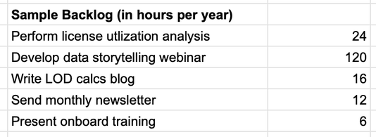 Time is finite and this is one way that a skills quiz can help you and your community use their time effectively. If you dive deep into how quizzes can help you be more efficient and effective in your enablement, message me on LinkedIn. *This is a referral link because I love the platform so much. It doesn't cost anything to you, but it does help me. If you don't want to use the referral link, that's totally cool. Here's the non-referral link to the Interact.
I think there's this myth that the dashboard a developer builds will be so good that people will naturally gravitate towards it and it will be a smashing success. You can't just build it and expect people to use it.  Stack the odds in your favor so that dashboard adoption is like a dream with these five steps.
1. Adopt user-centered dashboard design.
How will the dashboard solve their problems, how will they use it. Make it all about them. 2. Be your dashboard's hype (wo)man. If you don't love and advocate for your own dashboard, don't expect anyone else to. 3. Show and tell. Show them and tell them how to use the dashboard and how it can make their lives easier. 4. Make it easy for users to access it. Embed it, pin a link, set it up for subscriptions. Find out what's going to help your user use it and do that. 5. The fortune is in the follow-up. Make it easy for them to ask questions and give feedback. Let some time pass for users to get accustomed to it and then ask them if the dashboard is helping them or if you need to make any changes. No news does not always mean good news. I'll dive into adoption more in future posts. But for now, let me know how these five steps help you!
This is a section of a talk that I've given at user groups and conferences to help people make more accessible data experiences. It is based on my knowledge and experiences that I feel compelled to share with others.
|
 RSS Feed