|
Have you ever looked at a visualization and think, "How'd they do that?" I know I have. 🙋🏻♀️ So much like the Tableau podcast I used to co-host, I decide that I would find out, put it in my own words, and share out on my blog so I remember how to create them later because my memory 👎🏻. So for my first HTDT, I was looking at the Workout Wednesday site and found the comet chart challenge. I was more interested in the how'd they do that than meet the specific requirements that were outlined. So off to google I went and that's where I found Steve Wexler's blog on comet charts. For a minute, I thought I might just make the chart following Steve's directions (his screenshots are on point), point to his blog, and call it a day. However, you know how it makes more sense when you put it in your own words? So I decided to reserve engineer this Comet Chart from a few of the screenshots. 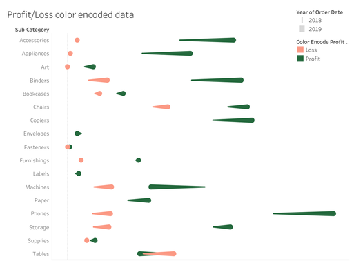 A light red and dark green comet chart to show the change from year 1 and year 2 for sub-categories. Why'd they do that?Before I get into the HTDT, I want to share why you'd use a comet chart. It's an alternative to side-by-side data comparison for two time periods. Is a good alternative? Well, that's up to your audience. Here are some pros and cons of a comet chart: Pros
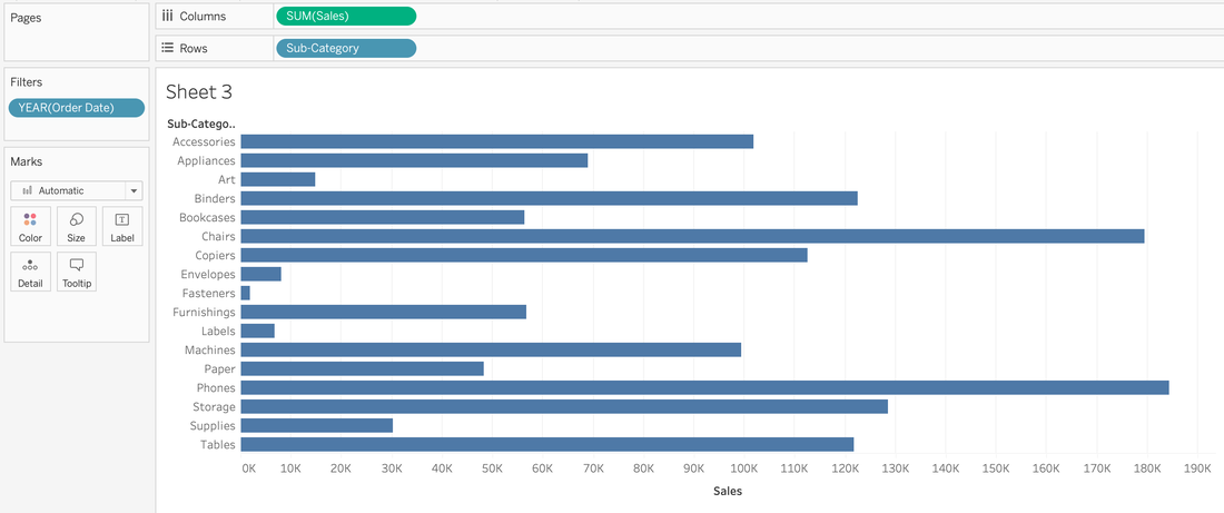
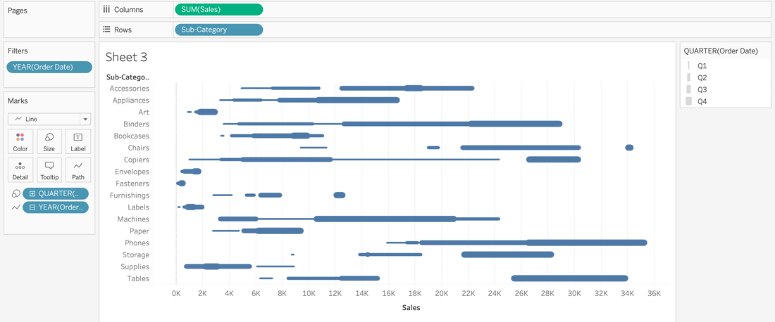
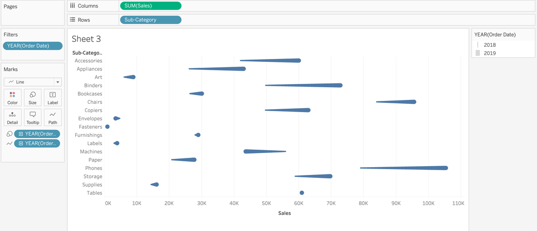
How'd they do that?
And that's how they did it!
0 Comments
|
 RSS Feed