|
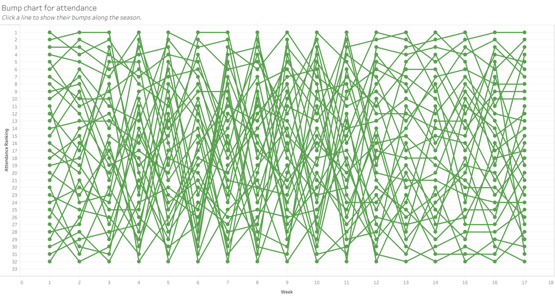
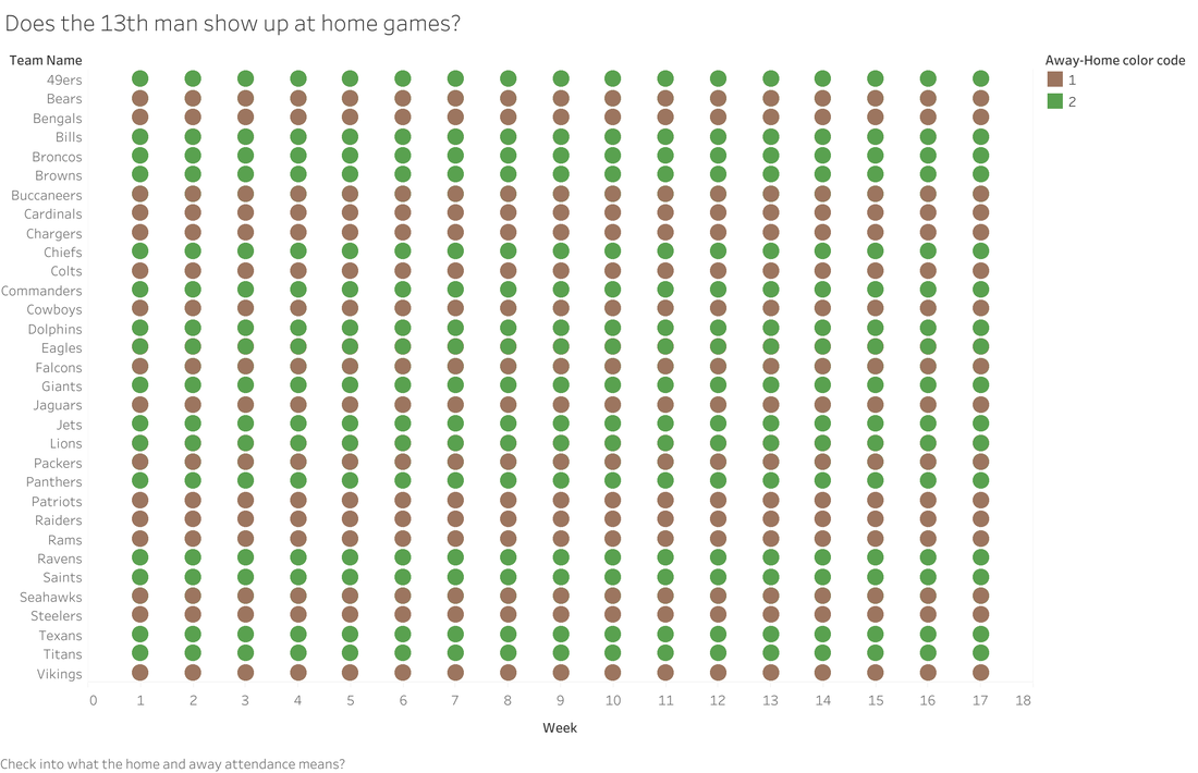
I recently used a Makeover Monday data set for pizza slices in NY/NJ. I had some cool ideas as to what I could do, but as I learned with my NFL Attendance Analysis viz (that's still a WIP), I really just need to time box myself to one night. With the NFL viz, I was going to visualize all teams at first, then I was going to focus on my home team, the Commanders. I was talking to my husband about this viz, and he said, "You know that they have reduced the stadium capacity, right?" Uh, no. I did not know that. And it would make for a great data story. I looked up stadium capacity by year and had a plan. By this time, it was beyond Monday & not only did I need to focus on other things, I was still trying to see if there was a chart I could tweak and salvage from what I had already done. I feel like these charts should be a piece of art called: "Life is messy, so are these charts" While I had an idea, I was just lacking on how to execute on it. My brain was messy like that bump chart. That's when I realized two things:
 When I did this viz, I didn't do much data cleaning or prep work. I basically just connected to the data and started to viz. And then I remember something from the mid-2010s, where there was a whole thing about not checking data quality while promoting visualizations. And while I'm not really promoting my viz on twitter or reddit, it is publicly available. That's when I decided to share in the details that this is practice and not rely on this visualization. I also decided to use a hashtag so that it was searchable and people/me could see all of fizzes where I'm touching the tool. And if you know me, you know that I love alliteration...a lot! That's why I decided to use #touchthetool as my hashtag. I love it and I think it will give me the permission to create (and clean, when needed). 
0 Comments
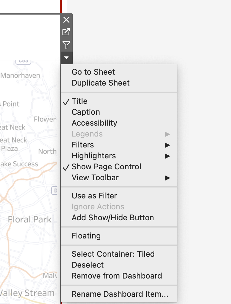
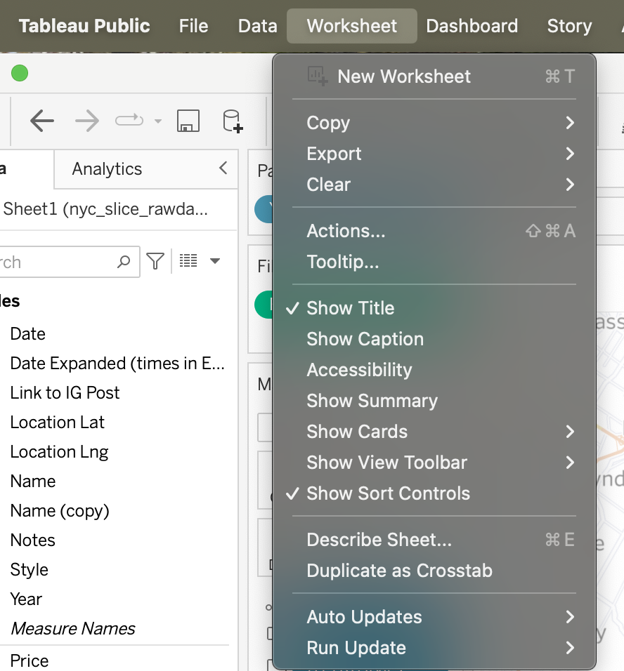
I think we know about alt-texting (provide a description alternative) images. But if you don't, you should alt-text .your charts because when a screen reader reads the image, it needs to convey the message of what the image is showing so that you can create a comparable experience. Do you know what Tableau generates for the alt-text in a chart if you don't change it? Check out the example below the map I have in a dashboard. 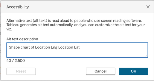 Alt-text chart dialog box in Tableau I don't know about you, but Shape chart of Location Log Location Lat doesn't exactly convey the insights or the data effectively. To change the alt-text, you can either navigate to the drop down arrow for the chart on the dashboard or use the Worksheet menu to navigate to Accessibility.
There are a few pieces of advice out there on how to write an alt-text description. I'm a fan of doing what works for you. Amy Cesal wrote this great piece about alt-texting charts. I'll share my approach in case it's helpful for anyone else. To describe a chart, write what you would tell someone when describing the chart to them. I used this approach to describe the plots on my map. 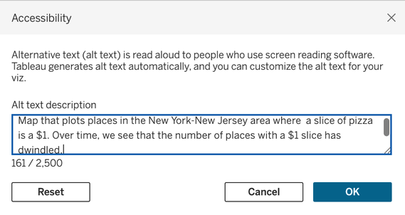 A more descriptive alternative text. If you have a publishing process or checklist, don't forget to add alt-text charts to that list to help people have a comparable experience between the screen reader and visual experience.
I've been blogging and involved in the Tableau community for 10 years as of this year. My first conference was in 2011 and it took me a couple of years to go from 'learn all the things' to 'learn, create, and contribute'. 10 years ago (as of September, I think), I remember being so excited that charts could be beautiful and informative, that I wanted to write about it. Since that time, I was a featured author, a 7x Tableau Ambassador until I stepped down, one of the first women podcasters in the dataviz space, founded a global conference, and helped create data+women (& d+w dc). It's been a lot. Throughout these ten years, I transitioned from away from blogging and vizzing. I created a Mother's Day card & comic pages in Tableau and as time went on, I lost my passion for visualizing data for fun. Enter this year's Iron Viz Feeder. I was inspired to visualize my Ulta purchases. I wrote about the inspiration in my LinkedIn newsletter on how I used Miro to help me with my process. I also had a really great conversation with Lindsay Betzendahl recently and I mentioned--it's like starting all over. Between the feeder and that conversation, I made a decision. I think 10 years in is a great time to get back to what I did ten years ago; viz & blog. A lot has changed over the years. I won't be involved in the hustle culture (#chronica11ychILL) & I'll be making vizzes for me--so some of them won't be best practice or the best way to viz something. One observation that I have about my 10 years of vizzing is that I've become less creative. So I'm on a mission to regain a little creativity. Here's to going back to the future. 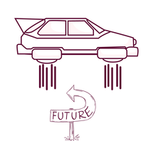 |
 RSS Feed