|
These days, I don't get into my favorite BI tool that much, but this past Friday, I spent some time playing with parameters. And this case, it was swapping parameters for dimensions and measures to create what I call the multiple choice chart. And the reason why I wanted to play around with this chart was because of something dashboard developers can suffer from...jampacked-itis. Their customers want allllll these charts or the dev wants to provide alllll these options and what happens? Too many charts and not enough focus and then reader suffers from idontknowwhatimlookingat-itis. What I learned a long time ago is that space is really helpful when it comes to dashboard design. I found an article that lists five benefits to using white space in design if you want to check it out for yourself. I've also been doing some work around the value of dashboards. No one needs a copy of a dashboard that's basically the same as the other one...that takes up resources (your time and space on the server). Here's a potential picture of the before swapping parameters. 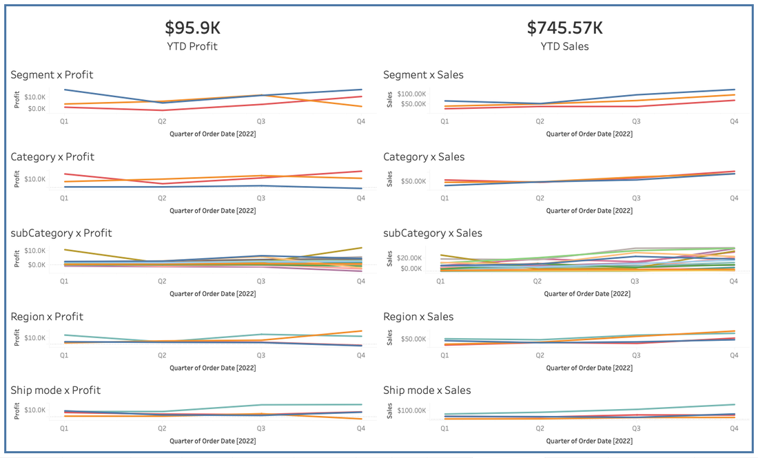 The above chart does have space between charts, so I gave the charts room to breathe, but I did so at the expense of chart readability, making this dashboard ineffective. By using swapping parameters, I can create something like this: While swapping parameters aren't new, they are a pretty powerful way to give your audience what they want without overwhelming them or overcrowding the dashboard.
If you want to see the calculations and parameters used to make this happen, read on.
0 Comments
|
 RSS Feed