|
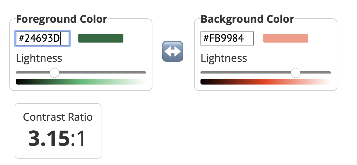
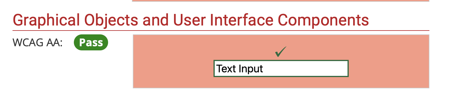
Around 2017-ish, there was a moment where red and green were a BIG no no...and if you used it, the dataviz police would come with their cop cars to let you know that it was WRONG. I will admit to having my moments of policing...whether I said them in my head or out loud. But like many things, if we only read the headline, we miss the whole story. When it comes to red and green, the story is contrast, not the colors per se. Contrast is Queen (or King, if you prefer) So, I when I was creating a comet chart for practice, I color encoded the data with a light red and a dark green. 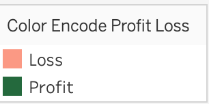 I checked these colors, just to make sure I was okay and yes--I was.
If you'd like, you can review the WebAIM site to explore the different aspects of how to use these two colors together. I also found a different website than the Coblis Color Blindness Simulator that I typically use to check for color blindness. I used a simulator from Pilestone that I thought had a great experience as well. The following is a screen recording of me testing these two colors for color deficiency. I addressed the technical aspects of red and green, but when there are alternative palettes out there, why would I use red and green? Color association. People understand that red means loss, danger, bad whereas green means good, health, profit, growth.
The big takeaways: know the story, not just the headline red and green are okay to use, just check the contrast first.
0 Comments
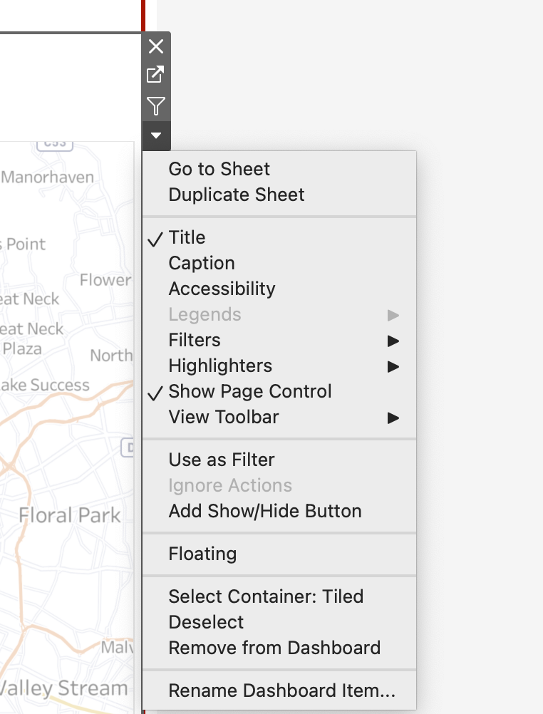
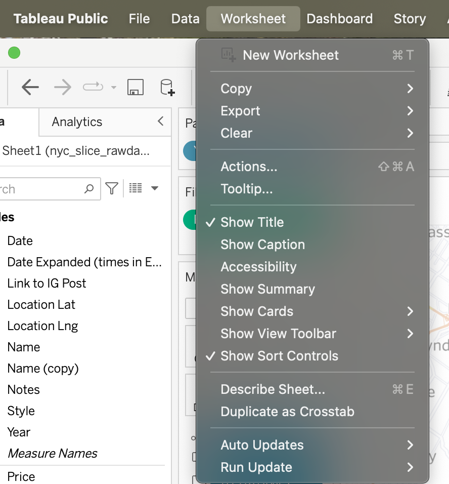
I think we know about alt-texting (provide a description alternative) images. But if you don't, you should alt-text .your charts because when a screen reader reads the image, it needs to convey the message of what the image is showing so that you can create a comparable experience. Do you know what Tableau generates for the alt-text in a chart if you don't change it? Check out the example below the map I have in a dashboard. 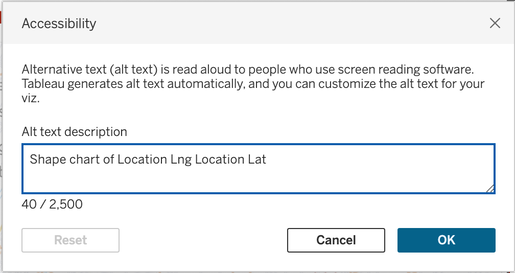 Alt-text chart dialog box in Tableau I don't know about you, but Shape chart of Location Log Location Lat doesn't exactly convey the insights or the data effectively. To change the alt-text, you can either navigate to the drop down arrow for the chart on the dashboard or use the Worksheet menu to navigate to Accessibility.
There are a few pieces of advice out there on how to write an alt-text description. I'm a fan of doing what works for you. Amy Cesal wrote this great piece about alt-texting charts. I'll share my approach in case it's helpful for anyone else. To describe a chart, write what you would tell someone when describing the chart to them. I used this approach to describe the plots on my map. 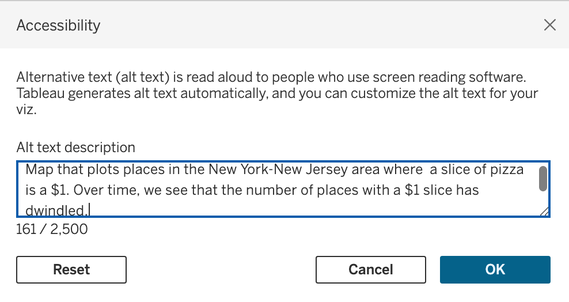 A more descriptive alternative text. If you have a publishing process or checklist, don't forget to add alt-text charts to that list to help people have a comparable experience between the screen reader and visual experience.
This is a section of a talk that I've given at user groups and conferences to help people make more accessible data experiences. It is based on my knowledge and experiences that I feel compelled to share with others.
|
 RSS Feed